Marx Design Celebrates The Joys Of 1980s Computer Graphics With StrangeLove Waters
No one likes to wait around for the office printer while their copies get jammed up or take an unnecessary amount of time to queue up. Also, remember offices, and, like, going to them? However, similar to YouTube clips of people power washing everything under the sun, there’s something deeply satisfying about watching a print-out from a 1980s copier go line by line as it virtually screams at you and prints something out. And while maybe that’s only appealing to a very slim minority of us, you can’t deny the distinctive and fetishized love for old school computer graphics that dominate the branding and packaging design for StrangeLove Waters. Developed by New Zealand’s Marx Design, this nostalgic deep-dive is dynamic and revels in ASCII code. We spoke with Marx Design's creative director Ryan Marx about the inspiration behind StrangeLove Drinks and its computer love.

Walk us through the design process that you went through for this project.
We’ve been working alongside StrangeLove for about eight years, often sharing ideas over late-night phone calls or dinner in Melbourne’s coolest eateries (Pre-COVID, when we could simply jump on a plane). StrangeLove likes to flip things around and completely rewrite the script. It’s not disruption for the sake of it, more a burning desire to rethink a product and category from the ground up. Following their Tonic and Soda range success, Strangelove believed the sparkling water category was ripe for a shakeup.
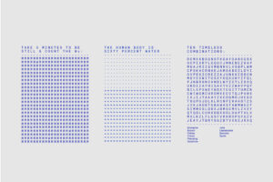
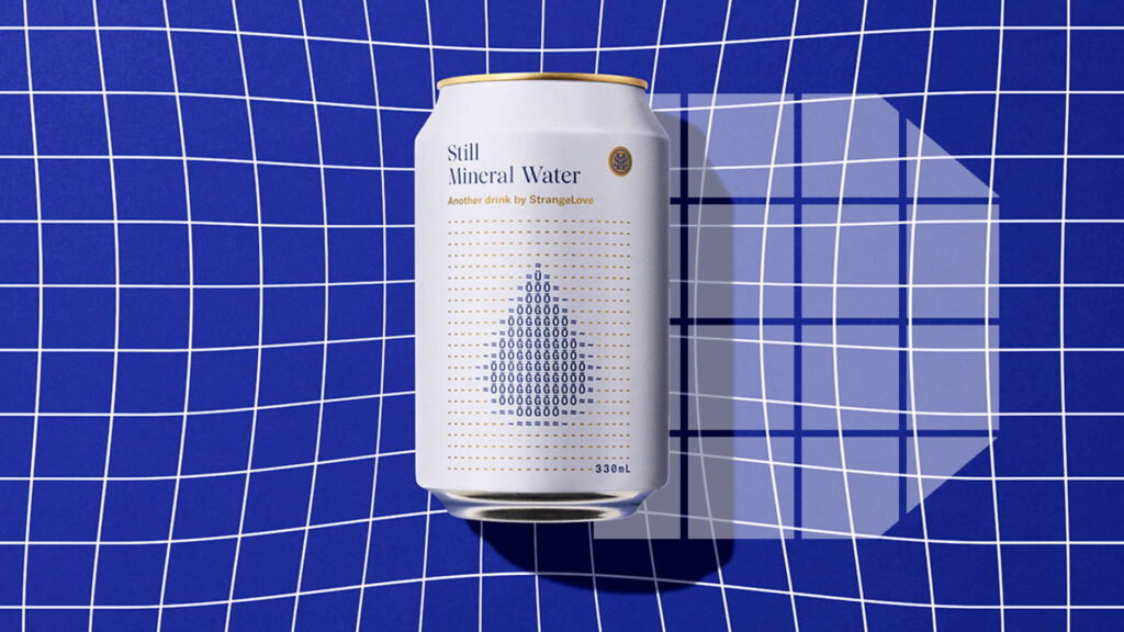
Our exploration took us to musty old periodic table charts from high school chemistry classes, a timeless graphic icon that took us into new territory. We discovered a graphic parallel in ASCII code, which represents text characters in computers and other digital devices, with a history dating back to telegraph systems. They engaged us to design “Another Drink by StrangeLove," a range of sparkling waters with zero sugar, yet rich in flavor. The drinks were destined for premium grocery, cafes, and restaurants, and would generate intrigue and a strong shelf presence while retaining the StrangeLove challenger attitude. Inspired by the simple letter/number combination in H2O, we explored the complex chemical concoction, diving deep into the analysis of mineral content, PH levels, and other labcoat-influenced layers of chemical makeup.
What was it about 80s computer game graphics that inspired the design?
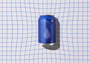
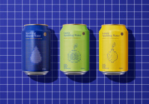
We took the graphic language into 80’s computer game graphics. The three product variants are multiple individual text characters coming together as a cohesive whole. An image of lemon, nectarine, and a drop of water emerge out of the code, as an homage to computer graphic coding imagery. This old-school look has a playful, pop-culture reference and offers the potential for hidden messages using text characters. We found a way to communicate a lot within a minimal framework. The graphic potential of a limited set of characters also fits perfectly with the design strategy for the StrangeLove portfolio of products; "borrowing from the past and modernising for the future."
What was one of the biggest goals you set out to achieve with StrangeLove packaging, and how did you accomplish it?
They centered "Another Drink by StrangeLove" around the idea of individual properties forming something new, fresh, and exciting. Unassuming on the surface but with depths to get discovered as you draw closer, just like the combination of one hydrogen and two oxygens. This is a product that brings an element of the unorthodox to a hugely popular but slightly staid category, yet retains a high level of design sophistication.

What was the most challenging part of this project?
Once we had an idea to hold onto, the remaining challenge was to make that idea simple. There were many roadblocks before we struck the right balance.

If you could pick one aspect of the finished design that you like the most or feel proud of, what would it be, and why?
Packaging is one aspect of overall brand development. As a studio, we get a lot of satisfaction in seeing the product and brand come to life in photography and supporting comms.
Share one lesson that you learned while developing the finished product.
Trust! It’s a classic. A great client allows you to create great work.

