Cleaning is inevitable. No matter how advanced or automated modern life gets, the ritual of sweep, scrub and spray is an inescapable part of existence. However, our desire for cleanliness often clashes with the desire for sustainable living.
Discarded single use cleaner bottles contribute to needless landfill waste, and harsh chemicals have a negative impact on the natural environment. Like many other aspects of consumerism, household cleaning is in dire need of a rethink.
Everdaily is a New Zealand based startup that believes dilution is part of the solution. Their non-toxic, plant and mineral based formulas contain no harsh chemicals, but their most radical idea is around the use and reuse of containers. The Everdaily line is based around two concentrates to cover every cleaning task, a one-size-fits-all approach to simplifying chores while drastically reducing plastic waste in the process. Rather than having separate cleaners for every room of the house, their vision is one product for all, simply topped up with water from household taps using refillable containers.

The cleaning system requires purchasing the spray bottles once only, repurchasing the refill as required. All the packaging is 100% recyclable: the reusable spray bottles are 100% post-consumer recycled PET, and the refills are natural HDPE.
Their mission is a worthy and noble cause but also one that requires awareness and education to drive behaviour change. The concept of refillable concentrates is very new to New Zealand consumers, for whom convenience and ease of use is still paramount. Everdaily had some barriers to overcome, while we saw some design conventions to willfully disrupt.
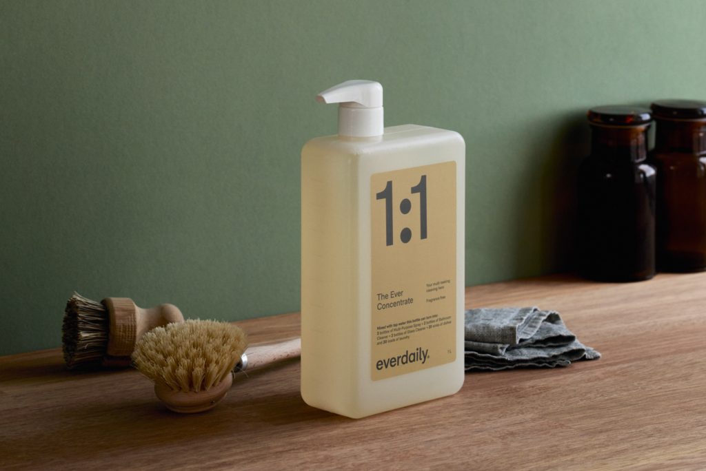
When developing the Everdaily packaging and brand identity we realised the need for functional, easily understandable design communication. The challenge of consumer products designed for a long life is how to make them classic and tasteful, creating an uncluttered aesthetic with a touch of elegance. We drew inspiration from the utilitarian design heyday of the 50’s and 60’s, when household packaging simply communicated what was inside with no hidden agenda.

Embracing this practical approach, we took the leap of putting maths front and centre.
The dilution ratios (1:1, 1:10 etc) were essentially a guide to use the product, building a design system around numbers had a practical simplicity with a minimal aesthetic. Communicating the correct dilution ratio was also functionally important, with the amount of concentrate determining the use of the cleaner. For example, more concentrate with water is required for heavy duty areas such as bathrooms, and less for streak free glass cleaning.

Our design thinking was underpinned by the notion that a perfect formula can communicate a lot, further explained by easy-to-use dilution instructions on the back of the packaging.
Using natural, slightly muted shades of blue and light brown, the dot icons of the ratio repeat into the pack graphic as bold full stops. The pack visually describes how a little can go a long way, using forms with a sense of trust and reassurance inspired by the need to subtly change consumer behaviour.
The outcome is a product with a look and feel far removed from the usual loud, cliched and blatantly single-use packaging of the cleaner category. A look that introduces a contemporary approach to cleaning with a functional, design-led desirability. Hopefully an item that consumers would be proud to have in their cleaning cupboard, or even accidentally displayed on the kitchen bench.

A household item designed for long life rather than being used and discarded, and most importantly, a product to form the core of a healthy, clean and completely sustainable home.