From the glory days of soda pop culture to the periodic table: we take a look at the inspiration behind some of Marx Design’s projects
The founder of Marx Design, Ryan Marx, talks us through a range of diverse briefs that the design studio has been working on recently.
The New Zealand-based graphic design studio, Marx Design, has been around for 12 years, Ryan Marx tells It’s Nice That. When Ryan founded the studio, the team was working out of a shed in Birkenhead, “at the time not a very cool place,” Ryan assures us. But as far as the team was concerned at this point, they could have been working out of a “tent.” What mattered was that the work they produced was good and they weren't afraid of working long hours to achieve it. Their tenacity paid off and since these humble beginnings, the team has gone from strength to strength. Ryan cites two particular “milestone” moments in the coming together of the company: when account director, Janine Bickerton, and creative director, Tristan O’Shannessy joined the team. The contributions of designer Manuel Payan in the past few years have also been particularly noteworthy. But generally, when it comes to discussing the design studio, Ryan steers clear of emphasising the roles of individuals, particularly his own. He prefers to promote Marx Design as a team and a company, and it is this collaborative spirit and everyone getting “their hands dirty,” which is clearly the firepower behind Marx Design’s success.
Browsing through Marx Design’s portfolio, one is immediately struck by the diversity and creative range of the work.
“That’s intentional,” Ryan explains, “we believe that one size doesn’t fit all.” Each brief is tackled with an individual, unique approach, informed by extensive concept research which is matched with a rigorous analysis of their competitors. This powerful combination allows Marx to break the mould, ensuring that its projects “stand out, rather than fit in.”
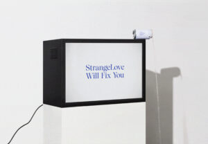
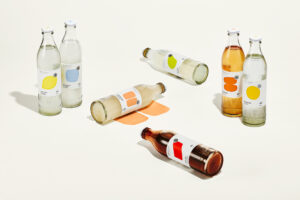
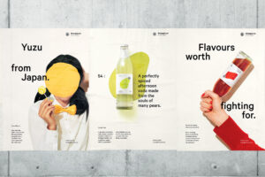
When Marx did a project for the “craft soda” company StrangeLove, the design studio’s “stand out” ethos was well-matched by the soda company’s own goals in the water industry: to “cut through the sugary sameness of the fizzy drink category.” The team jumped at this brief, which challenged them to engage with a “more analytical audience,” and create an appropriate aesthetic match for Strangelove’s playful and “irreverent copy.” The team put their heads together and concocted a unique design approach for the brand’s new line of soda drinks, which they named “premium abstraction.” This approach combines bold colour use with clean modernist graphics and a sophisticated neo-grotesk sans type. For inspiration, Marx looked to “soda pop culture’s glory days of the 1960s, 70s and 80s,” but it also looked as far back as “the origin of soda, with its roots as a small-batch brewed tonic made in apothecaries.” Its comprehensive research was interpreted through the lens of “premium abstraction” and a fizzy-fresh visual identity was born. Bright, fruity colours distinguish soda flavours and subtly add character to the sophistication of the overarching design system. A playful dot pattern also became a “key brand asset” for the project as it aptly evokes the irresistible effervescence of the fizzy drink.
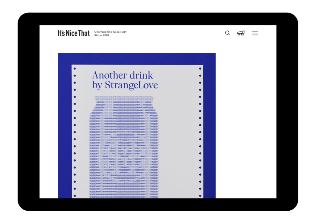
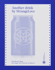
The team’s strengths in combining focussed research with slick visuals really came to the fore when Marx Design was asked to work on StrangeLove’s new line of sparkling water drinks. The concept for the project hinged around a simple combination of letters and numbers: the chemical symbol for water, H20. From here, the team took a deep dive into the language of chemical symbols and began exploring its parallels with ASCII code, the language of computer programming. Ryan explains how this research translated into visuals: “an image of a pear, apple and drop of water emerge from the code, a homage to how coding creates imagery in computer graphics.” The project breathes new life into the “musty old periodic table charts from sixth form chemistry class,” resulting in an identity that is at once nostalgic yet new, perfectly summoning Stranglove’s well-informed yet pioneering attitude to innovation in the water industry.
Comparing these colourful identities with other Marx projects allows one to get a wider appreciation of the team’s versatility.
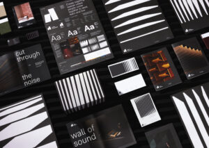
When it came to working with Autex, an architectural company that manufactures acoustics for built environments, the team opted for a stark monochrome colour scheme. The unique challenge with this brief was dreaming up a design that would be flexible and “robust” enough to be rolled out onto multiple marketing outlets. Choosing to use black and white not only ensured cohesion and flexibility for different marketing ventures but also provided a complementary background for the broad range of colourful Autex products. The identity was finished with a graphic representation of Autex architectural acoustic products which cleverly mimics the appearance of “variable audio wave patterns”.
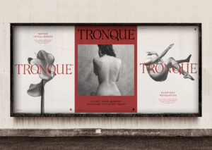
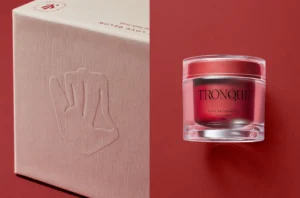
While the sleek monochrome palette communicates product efficiency on the Autex project, the black and white tones in Marx’s project for skincare brand, Tronque, convey a much more human, imperfect quality. Aiming to stand out from an industry flooded with “overly airbrushed supermodels in glossy high fashion images,” it opted for “soft, grainy” black and white photography which celebrates the “blemishes” and “imperfections” of the human body. A sinuous female torso graces the branding in a visceral blood-red, adding a final sensuous touch to the unpackaging experience of the product.
The versatile and precise Marx Design team is flourishing against the exciting backdrop of the current New Zealand design scene.
As he finishes the interview, Ryan stresses the important role played by the Design Institute of New Zealand in bringing design studios together through talks, dinners and events. Ryan explains how he has been inspired by the creative community he has connected with through DINZ, adding that “over time, we have all become good friends.”
Original article: itsnicethat.com

