Marx Design call upon ‘60s Swiss design traditions for Autex Acoustics’ timeless visual identity.
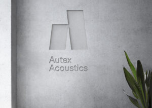
Leading New Zealand’s interior acoustic product market, Autex Acoustics has begun expanding towards Australian, US and UK audiences, providing their clientele – commercial or residential – with the products necessary to reduce atmospheric noise. Having previously operated with a brand that spoke with an overtly corporate voice, the team turned to Auckland-based creative studio Marx Design for a fresh visual identity that instead speaks directly to the consumer on a more personal, confident and original level. Shifting their brand image to emphasise their role as design-led innovators in the industry.
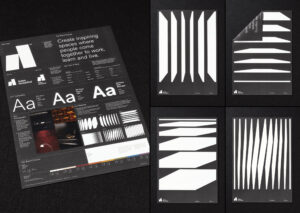
With this in mind, Marx Design turned towards the timeless; co-opting classic, slick Swiss design to demonstrate the pragmatic nature and enduring taste of the brand, whilst appealing to their design-savvy audience base – championing both form and function. This was made possible through Marx Design’s dutiful choice of typeface, opting for CoType’s RM Neue as the brand’s font family. “Our intention was to design a brand that feels ‘timeless,’” Creative Director Tristan O’Shannessy tells us, noting the need to feel both contemporary and established, “RM Neue has its feet firmly in both camps,” he explains. “It has a utilitarian, functional quality that would feel at home in a Müller-Brockmann catalogue from the early sixties,” O’Shannessy suggests, “and somehow feels equally at peace in the company of the great brands you showcase on The Brand Identity,” recalling the quality of the typeface’s design, and the effortlessness of using it. “It’s also a really well constructed typeface and a joy to use, which is essential for brands that are in global markets and have their own design team,” O’Shannessy qualifies, “it makes quality control an easier proposition.”
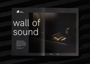
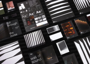
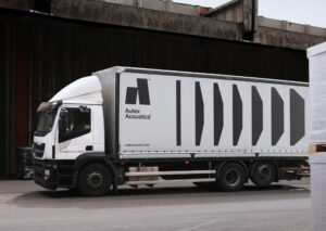
In line with the principles of the era and style behind the brand’s inspiration, an energetic, variable graphic pattern was introduced to balance the typographic compositions and monochromatic colour palette throughout the identity; taking the abstract form of declining soundwaves. Serving not only as the type’s counterpart, the soundwaves also provide a distinctive, unique and ownable motif that can be scaled up or down when required. Cementing the sincerity of the brand, as well as providing the space for it to express its character along the way.
Original article: the-brandidentity.com

