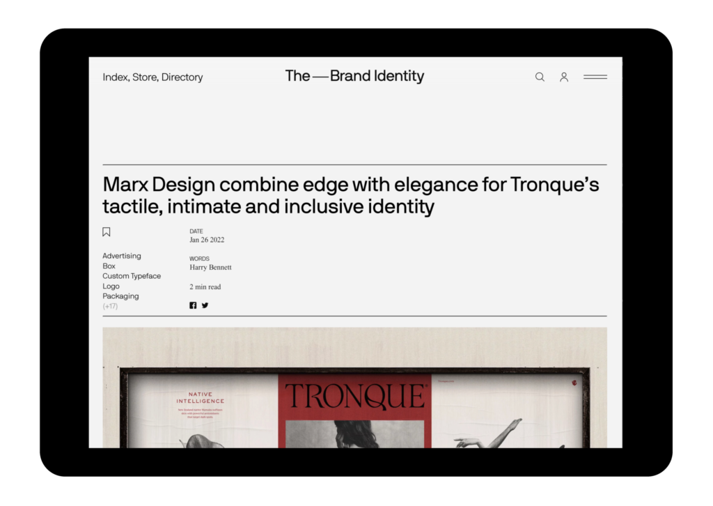
Marx Design combine edge with elegance for Tronque’s tactile, intimate and inclusive identity.
Gender, ethnicity and skin-type inclusive skincare brand Tronquepride themselves on celebrating the beauty in individuality across their product range. Seeking to set themselves apart from the congested nature of their market, they collaborated with Auckland-based creative studio Marx Design to provide the harmony between elegance and edge they desired.


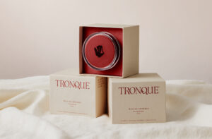
To achieve this, Marx Design turned to the human body to draw inspiration, looking to typographically translate its figures, forms and curves through the striking use of Roman serif Jugendresen from Pretty Faces’ Jean Wojciechowski. “We needed something with a condensed proportion, a tighter fit and a thicker stroke if we wanted the brand to stand out on shelf,” Senior Designer Manuel Payán tells us. “Therefore the ‘R’ and ‘Q’ are completely bespoke,” he notes, recalling Marx Design’s bespoke alterations to the typeface. “Jacob Wise’s playful type experiments were a great source of inspiration for these characters.”

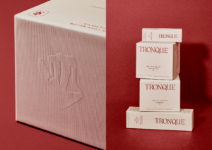
Supporting Jugendresen is Ivy Journal from Ivy Foundry, providing the brand with an established tone, grounding the flourishing forms of the wordmark. “We chose Ivy Journal because of its traditional lines and fashion magazine feel,” Payán explains, “not to mention its outstanding legibility in small sizes,” noting the practical perks of the typeface that helped to convey the details required on skincare packaging.
The personability and physicality of the typeface’s inspiration are further emphasised in the tactility of the packaging’s print finishes; utilising high-end finishes and embossing to convey an innate grace and intimacy between the product and the buyer. In doing so the final product both stands in opposition to the typically monochromatic tones of competitive skincare brands; bolstering their appeal to intimacy through the acute, crimson colour palette, whose hues invoke themes of affinity and inclusivity.
Original article: the-brandidentity.com

