The rise of non-alcoholic drinks is quickly becoming a real social movement.
Fuelled by events like Dry July and driven by the millennial and Gen Z desire for health, wellness and clarity over getting wasted, the race is on to develop products that don’t taste like inferior versions of the real thing. However it’s also a highly competitive and crowded space with a lot of brand noise and speculation. To stand out from the pack with a successful new product takes both commitment and a dose of lateral thinking.

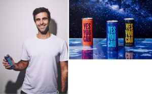
Former Olympic athlete Tyler Martin had a vision for a non-alcoholic drink promoting more focussed and healthy socialising.
Inspired by his own frustrations trying to find decent alternatives to booze while training, he painstakingly developed his recipes alongside world class mixologists. All that was missing was a distinct and honest identity to bring the brand to life. Working closely with Tyler to help realise his ideas, Yes You Can was born.

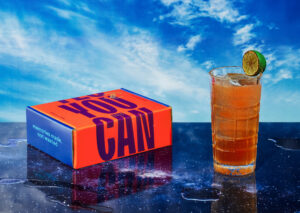
Whatever the reason for choosing to go alcohol-free, Yes You Can offers a way to master your morning after or simply find the right balance on a big night out. Sparking the interest of alcohol drinkers and persuading them to try was part of the challenge, having the product mistaken for the real deal was a compliment not a curse. The varieties were based on classic mixed drinks, featuring non-alcoholic versions of cocktails such as G&T and Dark and Stormy. Aimed at seltzers drinkers craving a healthy alternative to RTD’s, with notes of bitterness and heat to mimic the taste notes of alcohol, YYC offered a sophisticated alternative to sickly sodas and bland, boring waters.
The Yes You Can brand identity was inspired by themes of choice, balance and “taking the piss out of drinking”.
Our challenge was to inject a fresh approach into a red hot category while avoiding the usual clichés. Conscious of how many other non-alcoholic drinks take an almost militant stand against booze; our goal was to make Yes You Can refreshingly non-judgemental, a chance to de-stigmatize drinking less with a more positive and inclusive slant.

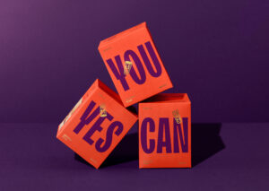
The brand name became a statement of intent, referencing the willpower required to cut down and giving permission to do your own thing. This concept of “statement as brand” helped to inform and guide our design exploration, the message also had potential to move in a range of design directions, driven by a positively empowered vibe with playful imagery.
We developed a wordmark with a bold, handcrafted look utilising the whole face of the can, a nod to street poster graphics.
It is striking but not too serious, lending itself to bright colour contrasting combos for each of the carefully mixed flavours. This use of simple, solid colours helped create a vibrant look that would stand out on the shelf and communicate the unique proposition of the product inside. Illustrations of bright, shining eyes and carefully balanced scales portray alertness and sharpness, visually describing the moments of clarity provided by staying sober.

The result is a brand designed to normalise drinking less.
It’s aimed to appeal to a wide range of consumers interested in cutting down while not wanting to compromise on taste; from pregnant women to sober drivers to high performance athletes. Yes You Can brings a fresh attitude to the non-alcoholic drinks category, more empowering, less earnest and with potential to grow into a staple for a sober-curious generation eager to savour every moment with more clarity.
Find out more at www.yesyoucandrinks.com

