
After 20 years of leading the way on all things ethical and environmental in specialty coffee, Kōkako Organic Coffee Roasters wanted to take their offering to the everyday consumer in-store – the retail segment needed an ethical shakeup.
To separate it from their café offering, this coffee range needed a new name and identity. It needed to speak to a conscious consumer and look good in kitchen, as well as retain a connection to its Kōkako Roasters credentials.
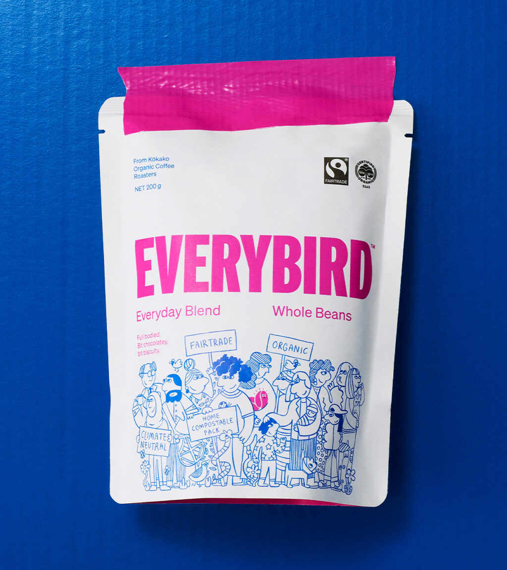
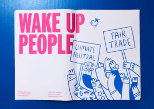
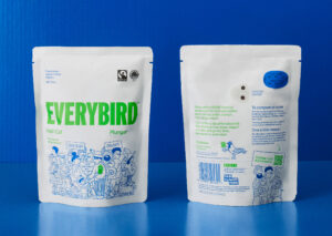
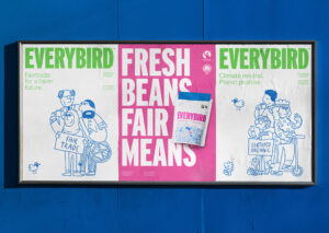
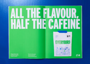
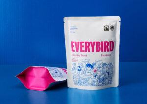
Everybird was born with a nod to the flora and fauna Kōkako strives to protect and the inclusivity they strive for socially, this coffee is for everyone – Fairtrade, Organic, Climate Neutral, and compostable packaging… not to mention top quality, specialty coffee.
With so many important messages to convey, how do you make sure they’re all heard? Our approach was to make a hero of the messages and the broad demographic of New Zealanders that support them – a cross section of NZ’s many peoples (and pets).
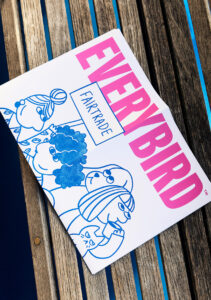
High contrast white and vibrant colour was used for the bold brand mark to standout on crowded shelves. Ink-blue was used for the playful illustrations as a nod to homemade signs, and a tie-in to the parent brand Kōkako.
The result is a brand that’s serious and assertive about what it stands for, but neatly packaged up in friendly and approachable manner – full of charm and personality.
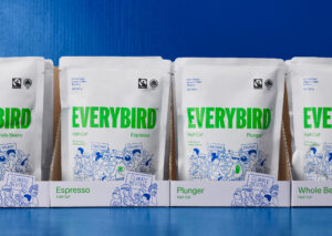
Everybird has enjoyed immediate success with retailers, gaining over 75 stockists across the country to date, with more to follow as they enter Countdown later in the year.