

Better Being
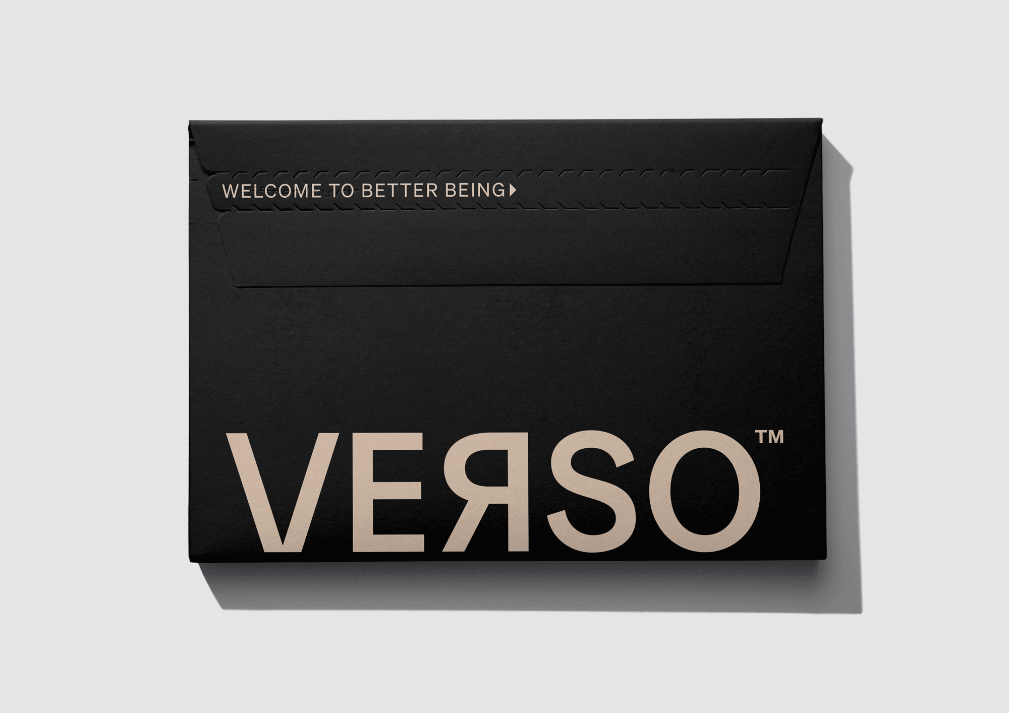
Verso is a Canadian based company that were looking to strengthen their existing brand and packaging within the US market.
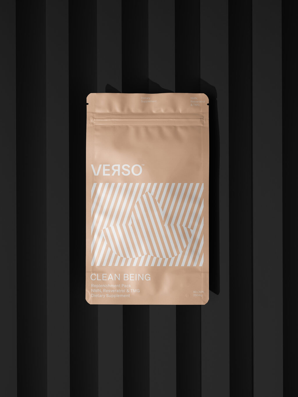
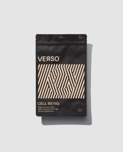
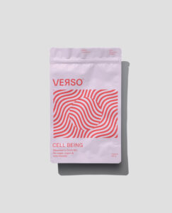
Using advanced technology, their core offering is a supplement that supports our bodies at a cellular level. NAD+ is essential for life; it’s a crucial coenzyme that is found in every cell and declines as we age. Verso is a precursor to NAD+, combining NMV (Nicotinamide Mononucleotide), Resveratrol and TMG, it is a synergistic mix of molecules that promote DNA repair and maintain metabolic homeostasis by raising NAD+ levels. It’s more than slowing down the effects of ageing – it’s also the prospect of a life lived better.
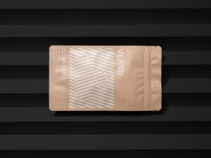
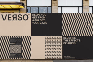
We took inspiration from the action of reversing the effect of aging and created a system of illustrations that give a sense of time moving forward, with the brand mark disrupting and reversing. Our back slash lines create a pattern that is instantly ‘Verso’, and becomes the brand architecture for future products and communications, giving the brand a system that will grow as they grow.
We introduced a neutral ‘nude’ colour to the core branding to balance the masculinity of the black and appeal to a wider audience, as well as a system of naming that spoke to product benefits, assisting with cut through to consumers.
Here’s to living better longer!