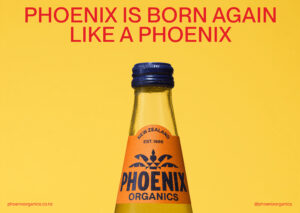
Phoenix is born again, like a phoenix.
Phoenix is New Zealand’s original organic drinks brand, established in 1986. Once a beloved household name, the brand had lost its way, fragmented across multiple product ranges and agencies, resulting in inconsistent design, diluted messaging, and declining consumer trust. Facing terminal decline and the risk of being disbanded, the client’s objective was clear: reinvigorate Phoenix and reestablish it as a trusted icon.
This project was driven by a need for transformational change, streamlining the portfolio, restoring brand cohesion, and reconnecting with a generation of Kiwis who grew up with Phoenix. The purpose was not just commercial recovery, but a restoration: to bring back a brand that once stood for quality, organic integrity, and Kiwi ingenuity.
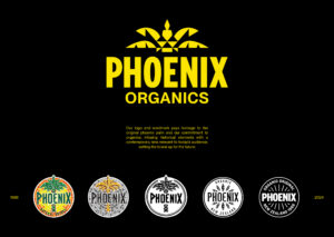
Phoenix is rich in legacy and nostalgia. We delved into its history, uncovering early logo iterations and brand assets that captured its original essence. The idea was to reinterpret these elements for a modern audience, resetting Phoenix as an iconic legacy brand with contemporary relevance.
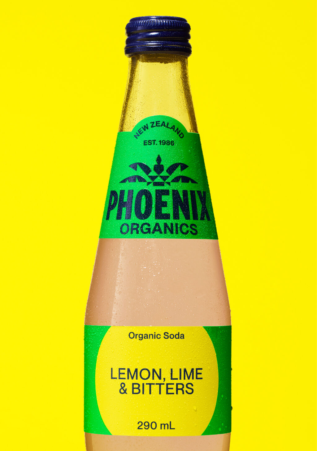
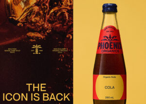
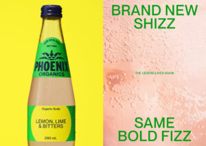
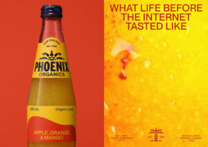
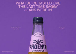
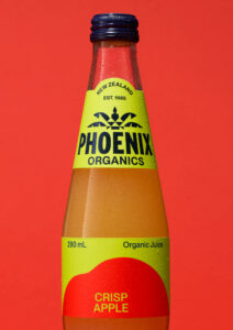
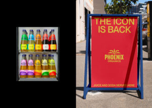
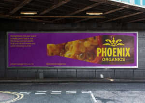
We unified the product range under a single bottle shape: the ‘Rocket’ bottle, first introduced in the early 90s, bringing visual consistency and recognisability. Messaging centred around the nostalgia of taste, delivered in a witty, understated Kiwi tone. The relaunch campaign leaned into the metaphor of rebirth: “The icon is back,” echoing the rising Phoenix and its return to the hearts of New Zealanders.
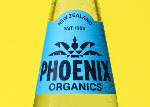
We crafted a sturdy typographic system designed to endure, paired with bright colour treatments that stand out in the fridge and on shelf. The logo was refined to reflect its heritage while aligning with modern design sensibilities.
The Rocket bottle became the hero, streamlined across all ranges to reinforce brand unity. Every design decision was made to rebuild trust, recognition, and emotional connection. The visual language is cohesive, iconic, and unmistakably Phoenix, designed to be both nostalgic and fresh, familiar yet forward-looking.
This project goes beyond commercial revitalisation; it’s a restoration of an icon. Phoenix is more than a drinks brand; it’s part of New Zealand’s organic movement and design history.
The streamlined portfolio reduces environmental impact through packaging rationalisation, while the design system ensures longevity and consistency across future touchpoints. By honouring its legacy and reintroducing it with integrity, Phoenix is reconnecting with loyal consumers and inspiring the next generation.